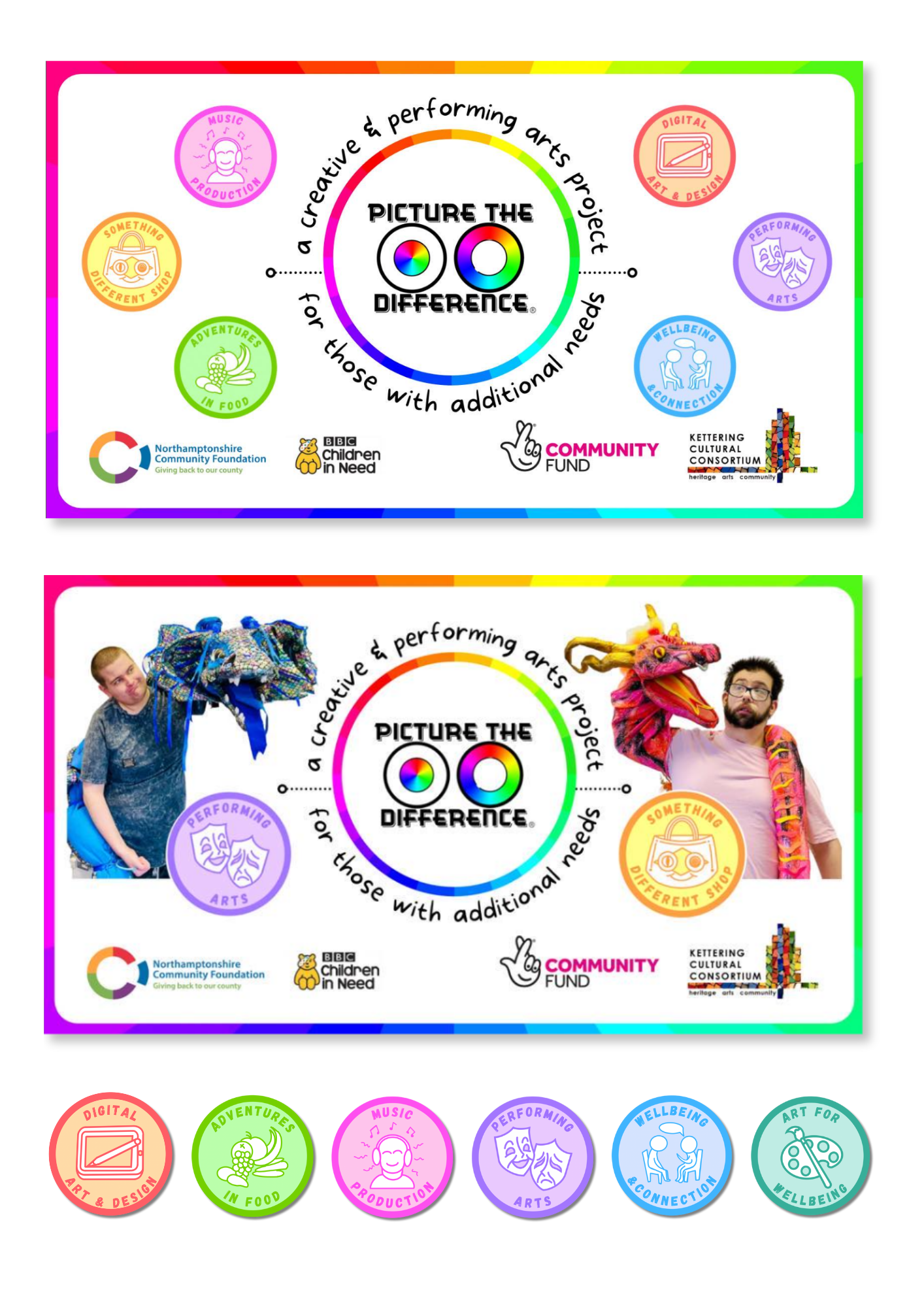

I designed a set of distinctive icons used in social media posts to represent the different types of activities on offer, making content clearer and more engaging for the audience. I also refreshed the social media cover designs to create a stronger and more cohesive online presence. These design elements along with the rainbow themed colour scheme aimed to enhance brand recognition of the Picture the Difference community project as well as increase the organisation's visibility across platforms.